Plotting maps
This notebook demonstrates how to visualize precipitation rate data using the emaremes library.
[1]:
import emaremes as mrms
Plot precipitation rate maps
Here, we download precipitation rate data for a specific date and time range using the mrms.fetch.timerange method. This function allows us to specify the start and end times along with the data type, in this case, “precip_rate.”
fetch.timerange returns a list of paths, even if we are only downloading one file.
[2]:
prate_files = mrms.fetch.timerange(
    "20240927-120000",
    "20240927-120000",
    data_type="precip_rate",
)

pfile = prate_files[0]
assert pfile.exists(), "File does not exist"
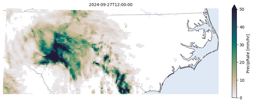
The mrms.plot.precip_rate_map function creates a matplotlib figure with the precipitation rate data from the MRMS file that is passed to it as its first argument. The second argument is just a state abbreviation to focus the plot on a specific state.
[3]:
mrms.plot.precip_rate_map(pfile, state="NC")
[3]:
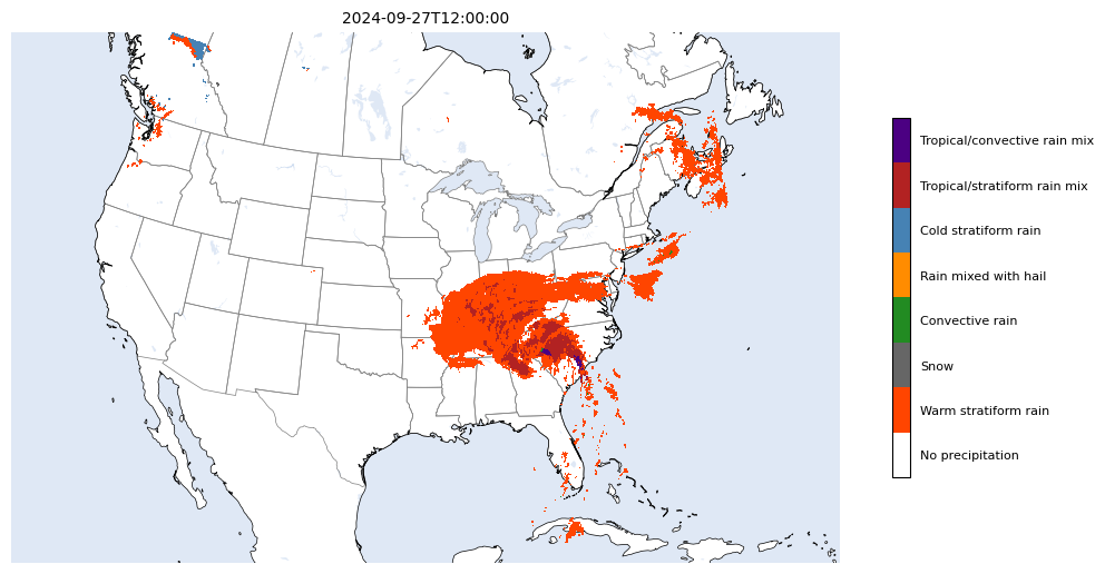
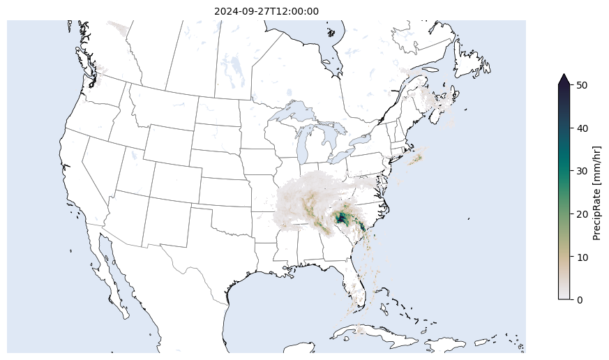
The plot.precip_rate_map function also supports plotting the precipitation rate for the full CONUS, which is the extent of each GRIB file.
[4]:
mrms.plot.precip_rate_map(pfile, state="CONUS")
[4]:
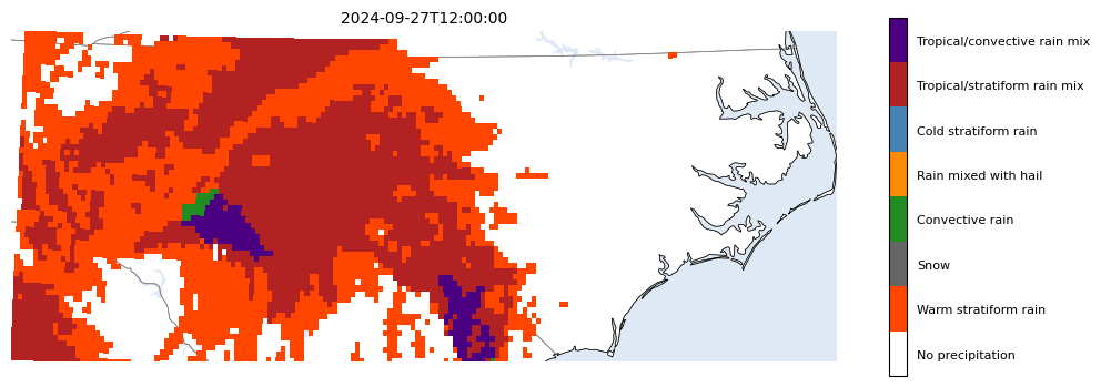
Plot precipitation flag maps
Similarly, the equivalent function for plotting precipitation flag maps is mrms.plot.precip_flag_map. It deals with the fact that these data is categorical so it uses a custom colormap to show the different precipitation types, and calculates the mode of the data instead of corseing the data with a mean aggregator.
[5]:
pflagfile = mrms.fetch.timerange(
    "20240927-120000",
    "20240927-120000",
    data_type="precip_flag",
)[0]

assert pflagfile.exists(), "File does not exist"
[6]:
mrms.plot.precip_flag_map(pflagfile, state="NC")
[6]:
[7]:
mrms.plot.precip_flag_map(pflagfile, state="CONUS")
[7]: